Prime Realty
Prime Realty is a fictional luxury real estate company I created as part of a personal project. This website was developed to showcase my skills in designing and developing modern and user-friendly website for the real estate company.
1. How it started
This was the personal project so I wanted to make something that actually gets used by businesses.
Real estate businesses are in need of a good websites(as per the internet) and it was another reason why I chose this industry.
2. Branding
After picking up the niche, I explored many real estate websites from various inspiration platforms and figured out the tone and vibe most of them were having.
With the use of chatGPT and detailed prompts, I made a basic identity of the company.
It mainly worked upon
Company name
Logo
Tone
Brand colours

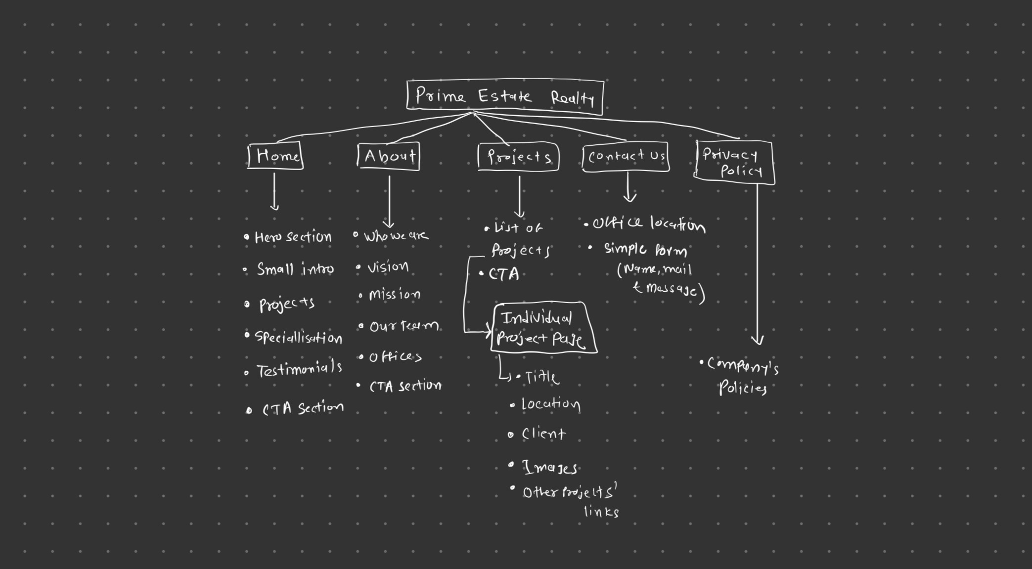
3. Sitemap and Wireframes
Sitemap
The sitemap part was very easy to make because most of the websites that I explored had almost the same structure.
Wireframes
After branding and sitemaps were done, I started making mid-fidelity wireframes in Figma.
It just took me around 3–4 hours to complete making mid-fidelity wireframes.

4. Development
After the wireframes were done, I quickly jumped into Framer, made color and typography styles to make the website consistent.
The development part was the toughest one because it was the first time I was actually making the website in Framer, so I had to learn some things in detail about Framer, like CMS pages and components.
In parallel, using ChatGPT, I produced content for the website as well.
I spent around 15 days to develop this website, and these were the pages I developed:
Home Page
About
Contact Us
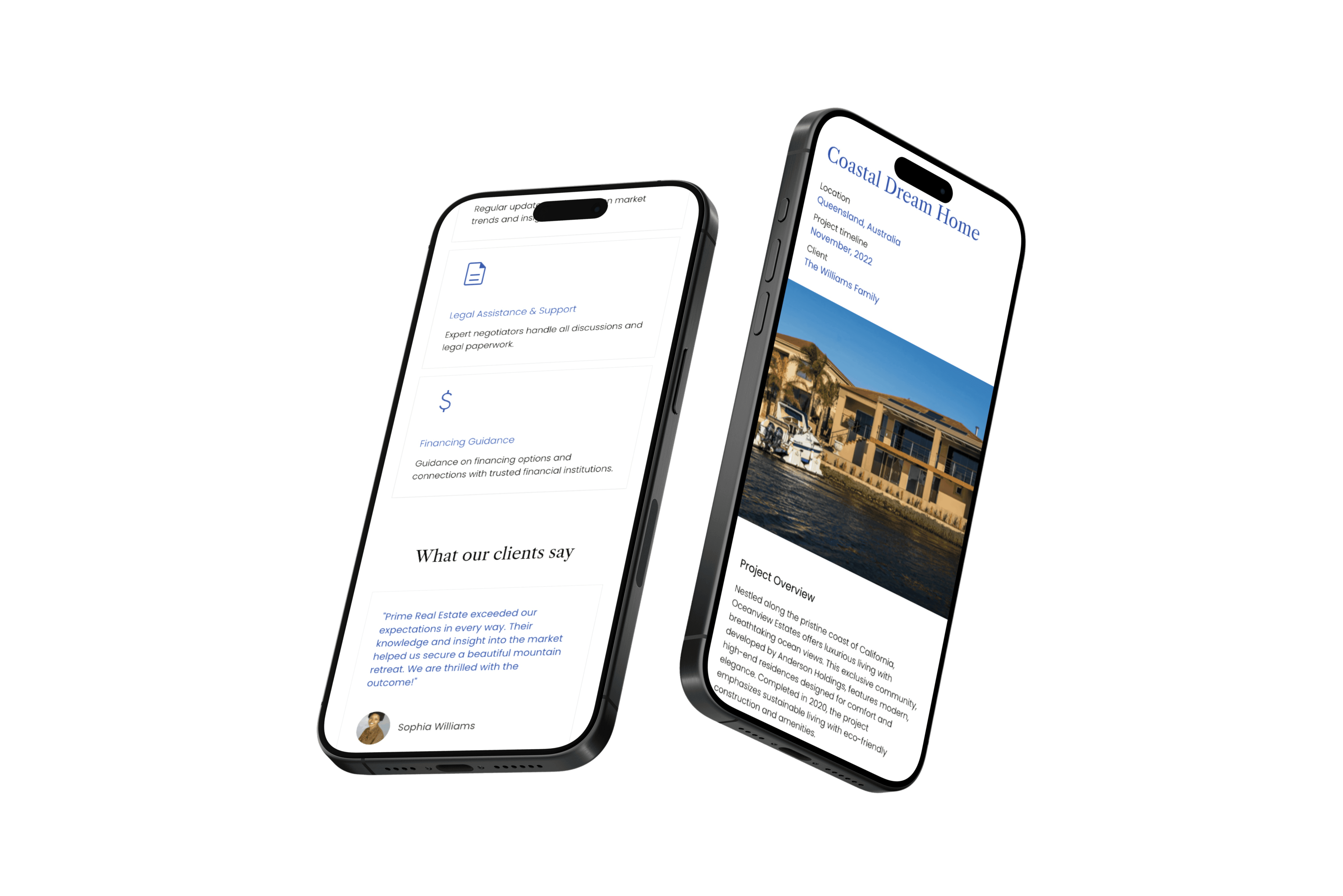
Projects Page
Project overview
404
Privacy Policy
5. Feedback
I was super excited to show the website to senior designers and Framer developers. I took feedback from 4 seniors, and all 4 of them had the same feedback, which was about the layouts I used.
When I see the older version now, it really makes me cringe! The layouts were making no sense; I realize I just made the website to incorporate fancy animations without focusing on business needs and the end goal of the website.
6. Iteration
After identifying all the flaws in the website, I started working upon them and did many major changes in the website.
Not going into too much detail but here is the list
Home Page Layout
The previous layout was cluttered and wasn't grabbing attention of the user. So I used a simple and effective layout this time, ensuring the CTAs are visible enough and takes the user towards the end goal of the website which was contact form.
Adding more sections
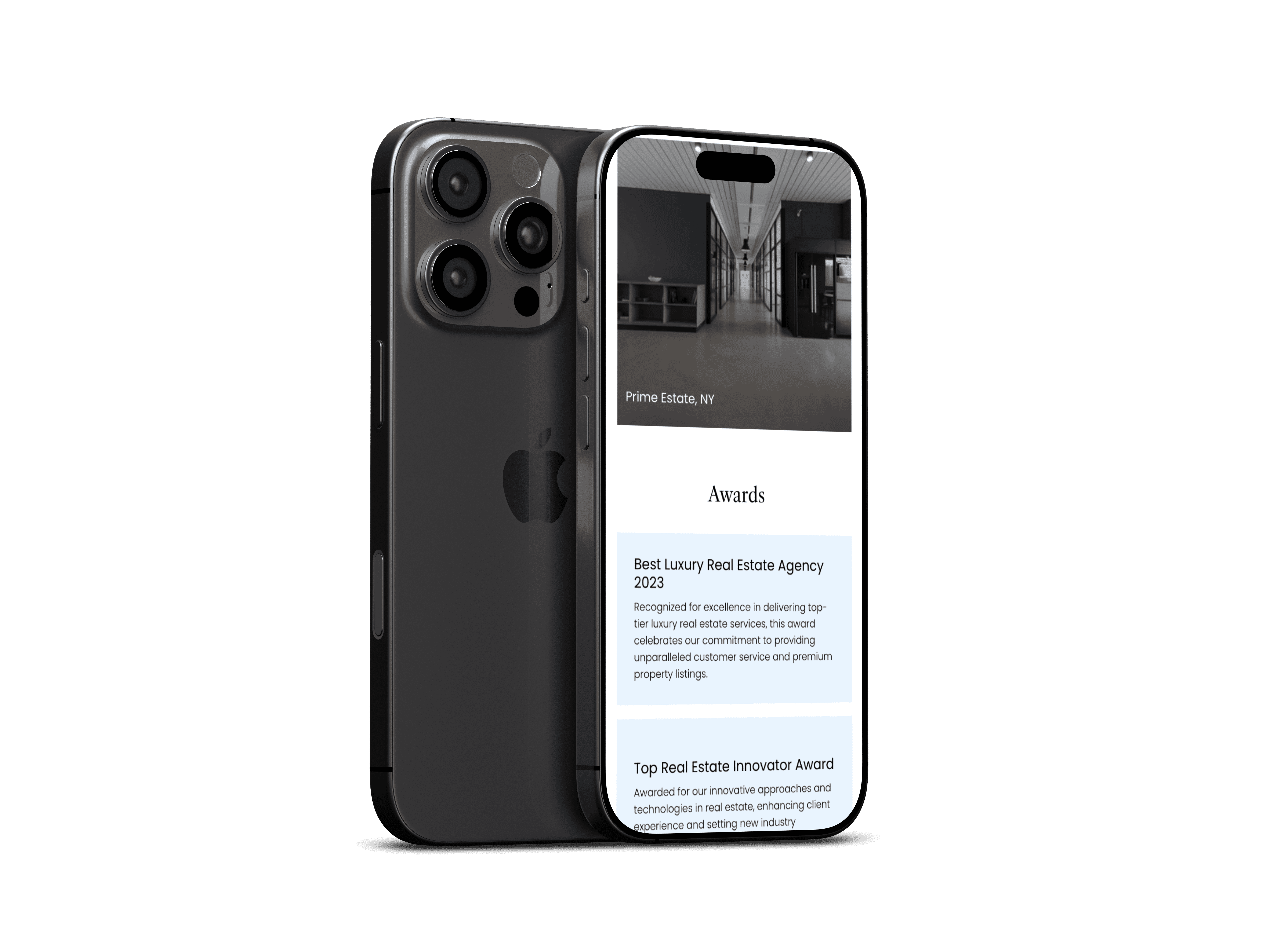
The main problem of the last version was that everything was too scattered and there was no flow of the website. So by analysing other websites again, I added more sections like awards, stats and FAQs.
Changing typography
I used 'Athene' typeface for the heading texts which was custom typeface and it was taking a bit more time to load the website. So I changed it with 'Libre Caslon Text' typeface which is a provided by Google.
Adjustment of spacing and elements
Previous version had some terrible spacing problems such as too much spacing between sections, very less padding of text elements and buttons used were not grabbing attention. I worked upon it and made the website look consistent.
Adding more minimal animations
I wanted this version to be extremely visually appealing and the easiest way to achieve it is to add minimal animations! I added more hover and appear animations on elements and smooth scroll effect on every page as well.